Design Dialog to Show/Hide Dialog Options based on Template
_cq_design_dialog node in your component's structure.helloworld / _cq_design_dialog / .content.xml
<jcr:root xmlns:sling="http://sling.apache.org/jcr/sling/1.0"
xmlns:granite="http://www.adobe.com/jcr/granite/1.0" xmlns:cq="http://www.day.com/jcr/cq/1.0"
xmlns:jcr="http://www.jcp.org/jcr/1.0" xmlns:nt="http://www.jcp.org/jcr/nt/1.0"
jcr:primaryType="nt:unstructured"
jcr:title="Hello World"
sling:resourceType="cq/gui/components/authoring/dialog">
<content jcr:primaryType="nt:unstructured"
sling:resourceType="granite/ui/components/coral/foundation/container">
<items jcr:primaryType="nt:unstructured">
<tabs jcr:primaryType="nt:unstructured"
sling:resourceType="granite/ui/components/coral/foundation/tabs"
maximized="{Boolean}true">
<items jcr:primaryType="nt:unstructured">
<main jcr:primaryType="nt:unstructured"
sling:resourceType="granite/ui/components/coral/foundation/container"
margin="{Boolean}true">
<items jcr:primaryType="nt:unstructured">
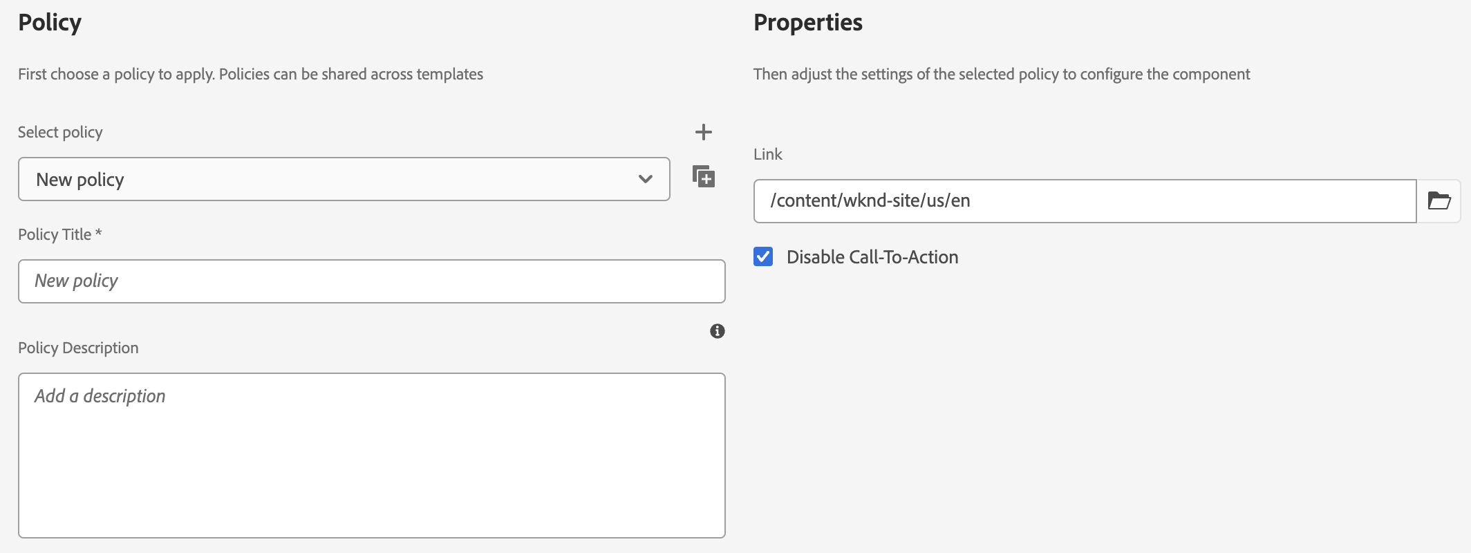
<link jcr:primaryType="nt:unstructured"
sling:resourceType="cq/gui/components/coral/common/form/pagefield"
fieldLabel="Link"
name="./link"
rootPath="/content/wknd-site"/>
<actionDisabled jcr:primaryType="nt:unstructured"
sling:resourceType="granite/ui/components/coral/foundation/form/checkbox"
text="Disable Call-To-Action"
name="./actionDisabled"
value="{Boolean}true"/>
</items>
</main>
</items>
</tabs>
</items>
</content>
</jcr:root>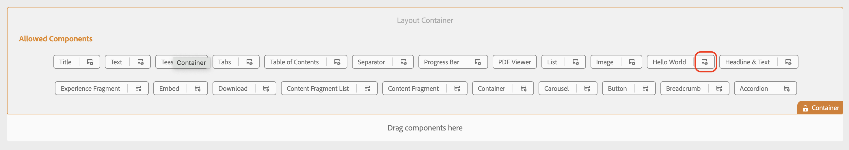
cqDesign.property_name. The complete example is provided below:helloworld / _cq_dialog / .content.xml
<jcr:root xmlns:sling="http://sling.apache.org/jcr/sling/1.0"
xmlns:granite="http://www.adobe.com/jcr/granite/1.0" xmlns:cq="http://www.day.com/jcr/cq/1.0"
xmlns:jcr="http://www.jcp.org/jcr/1.0" xmlns:nt="http://www.jcp.org/jcr/nt/1.0"
jcr:primaryType="nt:unstructured"
jcr:title="Hello World"
sling:resourceType="cq/gui/components/authoring/dialog">
<content jcr:primaryType="nt:unstructured"
sling:resourceType="granite/ui/components/coral/foundation/container">
<items jcr:primaryType="nt:unstructured">
<tabs jcr:primaryType="nt:unstructured"
sling:resourceType="granite/ui/components/coral/foundation/tabs">
<items jcr:primaryType="nt:unstructured">
<action jcr:primaryType="nt:unstructured"
sling:resourceType="granite/ui/components/coral/foundation/container"
margin="{Boolean}true">
<items jcr:primaryType="nt:unstructured">
<columns jcr:primaryType="nt:unstructured"
sling:resourceType="granite/ui/components/coral/foundation/fixedcolumns"
margin="{Boolean}true">
<items jcr:primaryType="nt:unstructured">
<column jcr:primaryType="nt:unstructured"
sling:resourceType="granite/ui/components/coral/foundation/container">
<items jcr:primaryType="nt:unstructured">
<link jcr:primaryType="nt:unstructured"
sling:resourceType="cq/gui/components/coral/common/form/pagefield"
name="./link"
fieldLabel="Link"
value="${cqDesign.link}"
rootPath="/content/wknd-site"/>
<action jcr:primaryType="nt:unstructured"
granite:hide="${cqDesign.actionDisabled}"
sling:resourceType="granite/ui/components/coral/foundation/container"
name="./action">
<items jcr:primaryType="nt:unstructured">
<text jcr:primaryType="nt:unstructured"
sling:resourceType="granite/ui/components/coral/foundation/form/textfield"
fieldLabel="Text"
name="./text"/>
</items>
</action>
</items>
</column>
</items>
</columns>
</items>
</action>
</items>
</tabs>
</items>
</content>
</jcr:root>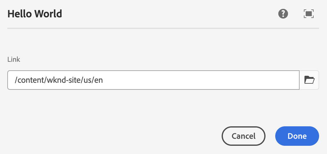
HelloWorld.java
public class HelloWorld {
protected Style currentStyle;
private boolean actionDisabled;
protected void init() {
actionDisabled = currentStyle.get("actionDisabled", false);
}
public boolean isActionDisabled() {
return actionDisabled;
}
}